Huet showcase
shadcn components, themed by Huet. Pick a theme with the button at the top right.
Every state, in the shadcn integration →Design team
3 of 8 members online
Ma
Maya ChenDesign lead
OnlineTh
Theo ParkEngineer
AwayIr
Iris AdlerResearcher
In a callTPJRKO
Reviewing 12 files+5
Create an account
Fix the highlighted fields to continue.
Enter a complete email address.
Weak: add a number or a symbol.
Available.
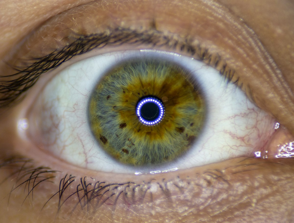

Human iris
1 of 5, recolored by Huet
Design review
Scores across six areas
+18%
This releaseLast release
Spending
October, by category
$5,490
+12% vs SepIssues
huet/showcase
12 open48 closed
Tooltip clips on mobile #482
MCbugdesign
Date picker dark mode #479
TPfeature
Slow paint on /create #475
JRperfbug
Document Lc targets #471
IAdocsgood first issue
export function ThemePanel() {
  const [theme, setTheme] = useState(
    themes.Base
    themes.Sunset
  )
  const [bg, setBg] = useState(1)
  const [bg, setBg] = useState(0)
  return (
    <ThemeConfigurator
      value={theme}
      onChange={setTheme}
      background={bg}
      onBackgroundChange={setBg}
    />
  )
}
Build failed
configurator.tsx: Type error on line 6.
2 warnings
Unused import: themes.Base.
Deployed
Sunset is live on production.