

Huet
Relative UI colors and themed images from one theme. Choose a theme, then give each element a ramp and a contrast amount in its class name, such as huet-bg-blue-20. Huet works out the actual colors from the element's parent background, and recolors images to match.
Demo · shadcn site themed with Huet · Docs
Quick start
pnpm add huet               # theming, any framework
pnpm add huet-react         # optional: the React theme configurator
import { mountTheme, themes, type Theme } from "huet";
import { mountImages } from "huet/images";
import "huet/styles.css";
const theme: Theme = { neutral: ["#233b91", "#ffffff"] };
const root = document.querySelector<HTMLElement>("#app")!;
const colors = mountTheme(root, theme);
const images = mountImages(root, theme); // recolors <img data-huet-recolor>
// Later: dark mode, then another theme, without rerendering
colors.update(theme, { background: 0 });
colors.update(themes.Paperback);Tip
Open the theme configurator from the header and drag its background slider. Every surface on this page, and every color inside it, is solved again for the new background.
Class syntax
huet-PROPERTY-[RAMP-]AMOUNT
| Part | Values |
|---|---|
| Property | bg, text, border, outline |
| Ramp (optional) | red, yellow, green, blue, purple, gray, white |
| Amount | 0, 5, 10, 20, 30, 40, 50, 60, 70, 80, 90, 95, 100 |
Amounts measure distance from the parent's background, not a fixed lightness. The same thirteen classes, on the page and nested in a huet-bg-80 card:
Migrating from Tailwind colors
One class per surface replaces each light and dark pair:
<section class="bg-slate-100 dark:bg-slate-800">
<section class="huet-bg-10">
  <p class="text-slate-500 dark:text-slate-400">Manage your profile.</p>
  <p class="huet-text-60">Manage your profile.</p>
  <button class="bg-blue-600 text-white">Save</button>
  <button class="huet-bg-blue-20">Save</button>
</section>
Themed images
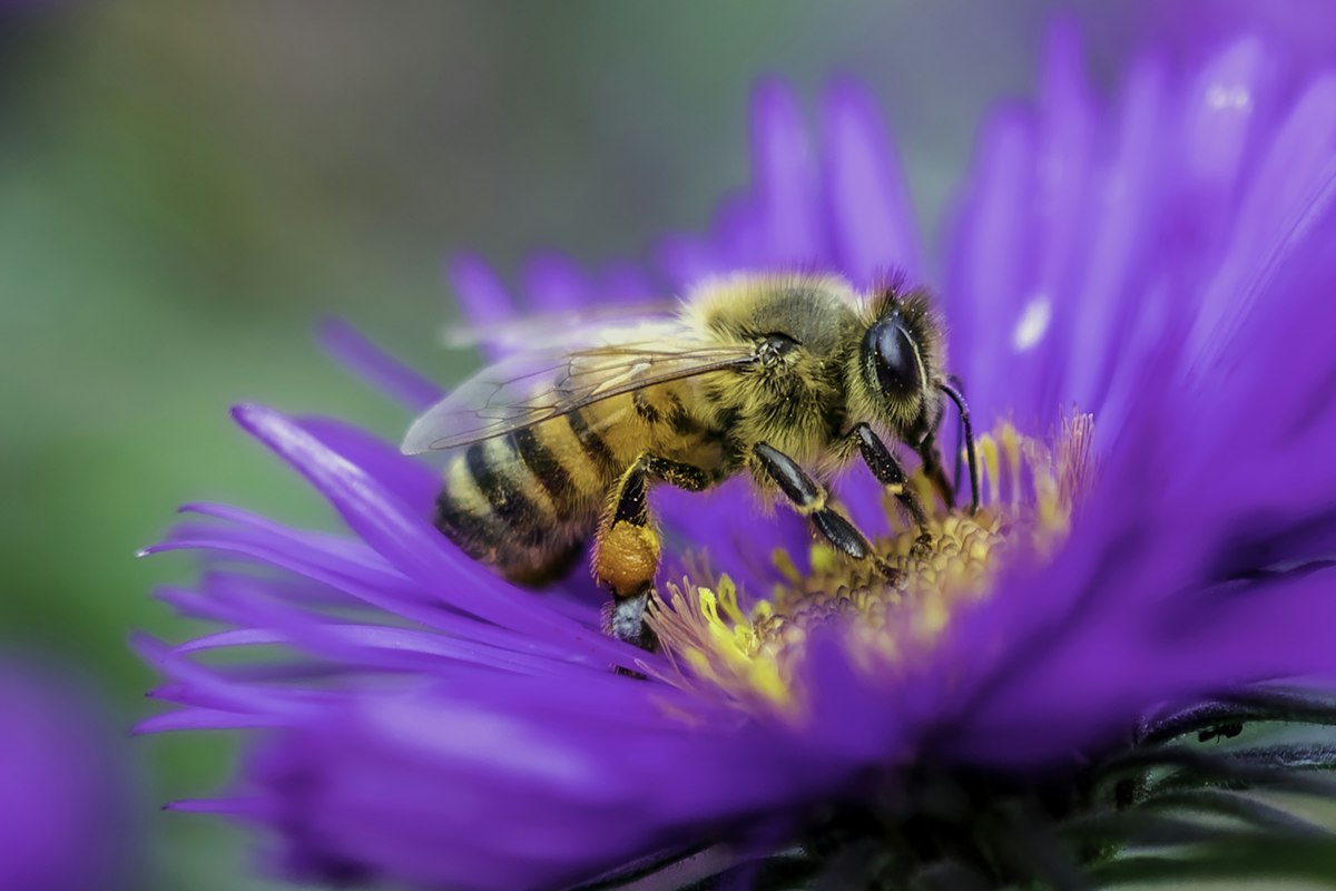
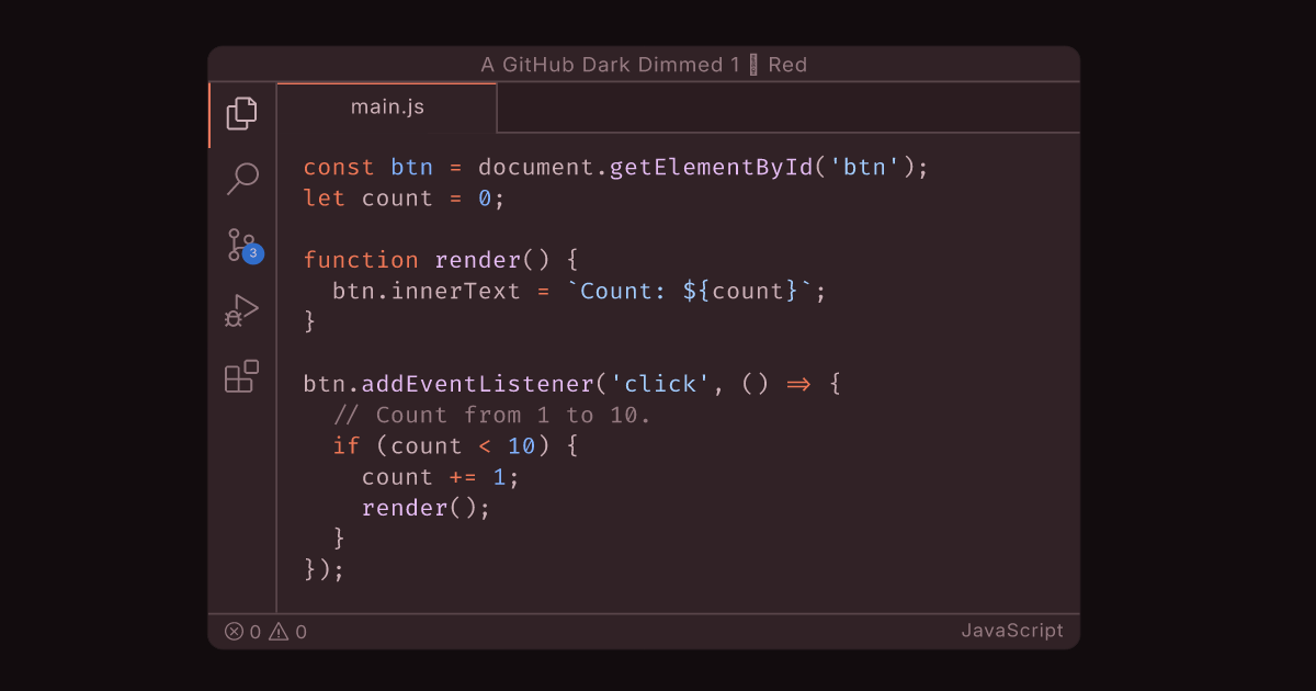
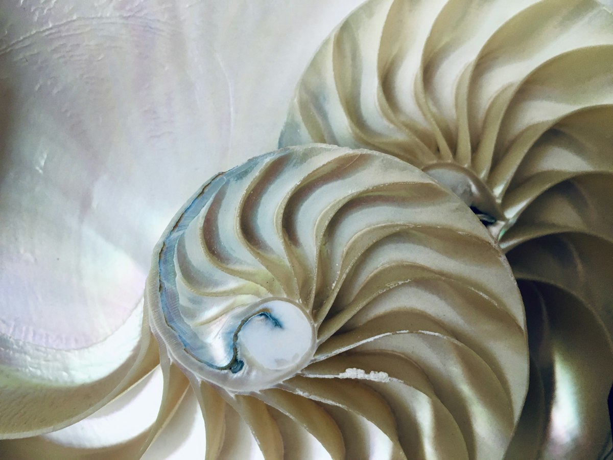
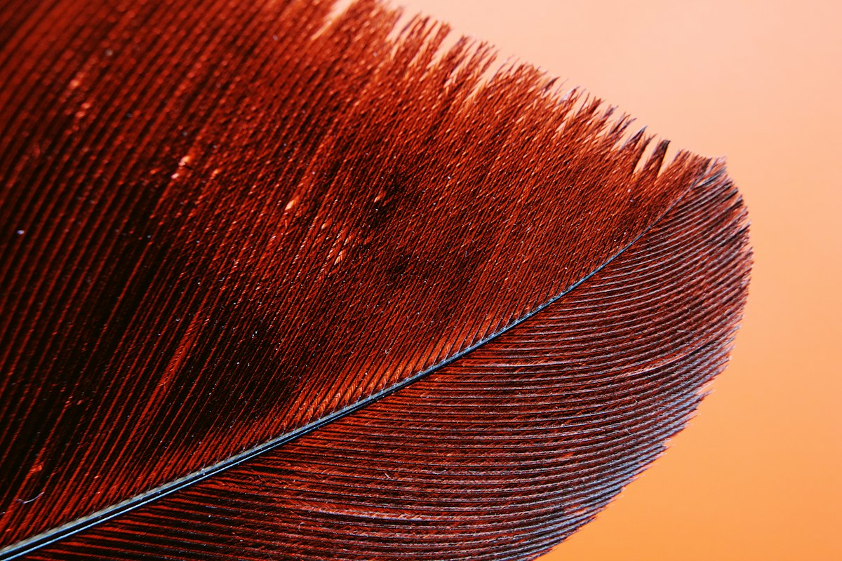
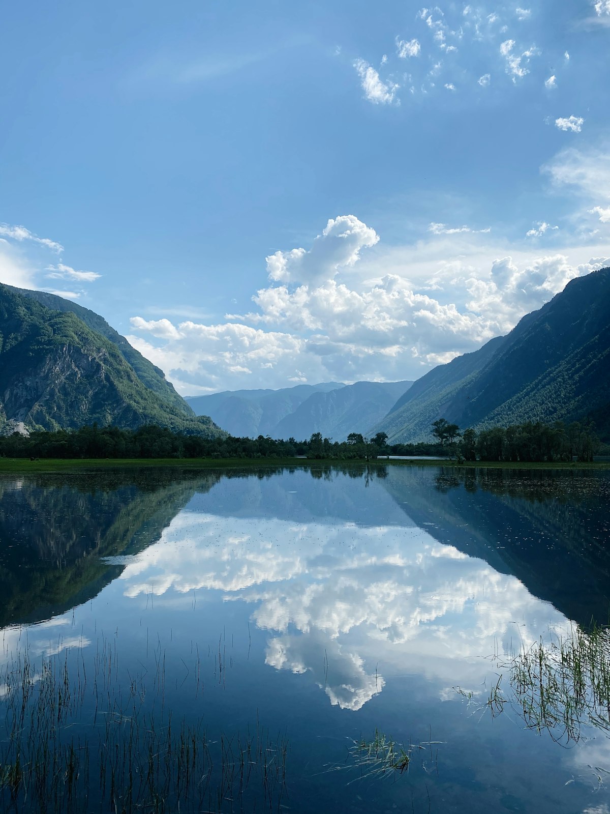
huet/images reads each pixel as a position on Huet's default ramps and writes it back at the same position in your theme. Grays follow your neutral ramp, and greens become your green. Screenshots work too:
Things to know
Note
Every color is solved against the background it sits on, so the same class reads well on a light page, a dark page or a colored card.
Important
Backgrounds must be managed by Huet for its relative colors to track them. Use huet-bg-* instead of bg-[…] for surfaces.
Warning
Cross-origin images need CORS headers and a crossorigin attribute to be recolored. Images Huet can't read are shown as they are.
Caution
Low amounts on a narrow ramp stay low contrast. Lc values are design targets, not a conformance claim.
Grays follow the theme's neutral ramp and colors follow its hues. That's the whole idea.
Roadmap
Repository layout
packages/huet: the theming librarypackages/huet-react: the React theme configuratorsrc/demo: the demo site, built with Astro, Tailwind and Huet classes